The AREsketches Style
Hello, 2017! The crew got busy towards the end of the year and suddenly it was February! We’re going co-op on this, and this month’s theme is from @BPaletz – style!
Note: This is the twenty-third post in a group series called #ArchiTalks in which Bob Borson of Life of an Architect gives a group of us architects a theme or a set of questions and we all have to post our response… this month’s theme: “Style”.
With AREsketches, volume 2 under my belt – one would assume that I’m starting to get a hang of these study guide sketches, that I might have a system in place…that it might contribute or create its own style. I hadn’t really thought about it much until a friend mentioned it. Sure, there’s a process to the sketches themselves. I’ve created a format and formula of how to pull the content from Ballast, create the sketches, share them, and get them ready for the printed format. I’ve even done a blog about that aspect. But to think about the style of the sketches themselves? Man, that’s heady. Let’s try and distill the AREsketches style down to its main components. First, some background for those who might not know what the AREsketches are.
The AREsketches started and grew from a desire to help other emerging professionals get licensed.
They grew organically as they were shared initially on my Instagram, then a newsletter, now (so far) two books. The goal is to break down all of the written content one must master as a part of taking the AREs (Architect Registration Exams) into bite-sized images that a tester – or a person simply interested in architecture – can digest.
380 books sold and 427 sketches shared later…and I guess you could say there’s an AREsketches style about the process. The process actually has a lot to do with the last bit of the explanation. It’s all about the benefit to the person learning. What will make them learn the fastest, retain the best, and recall correctly?
That’s the AREsketches style.
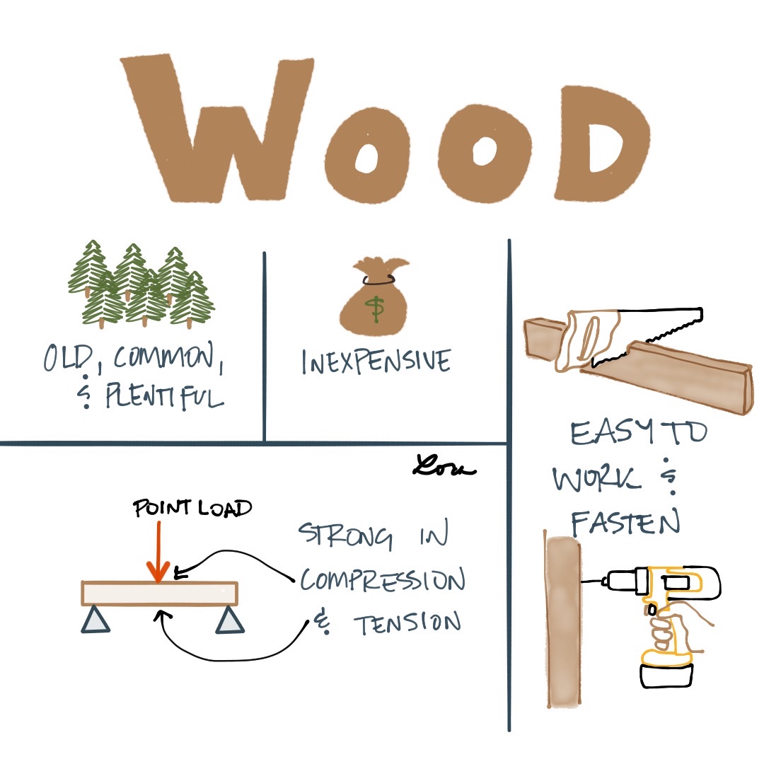
What does that mean? That means each sketch covers one topic. ONE. Sometimes that’s as broad as “wood” or as specific as “the location of different climate regions within the United States and their associated numbers.”

How does this contribute to the AREsketches style? It means you gotta KISS. No, not that kind – although it IS Valentine’s Day. You gotta keep it simple, stupid.
When I started drawing out the AREsketches to share, I went back to Ballast. Not because I didn’t trust my own notes, but because I didn’t trust my own notes for other people. That means you can’t take for granted that some quirky thing you might’ve learned in school was also taught to the millions of other kids in architecture school across the nation. You have to cover it all.
It also means…don’t go crazy with the details. If a sketch requires more than 3 details, it becomes separate sketches. The AREsketches style requires simplicity. It needs to be easy to digest and recall, which means if you’re stuck pondering to the extent that written explanations are required, you’re packing too much in. Here’s two examples of typical layouts:


So while the sketches may not be for everyone – I’m looking at all you licensed folk fist-pumping and cackling at your computer screens – for those who are testing or simply find themselves interested in architecture, the AREsketches style lends itself to be accessible to all. One bite, one flip of a page, at a time.
What’s your style?

To see the take on “Then & Now” from other Architects, follow the links to the others in the #ArchiTalks group who are posting today on the theme:
- Bob Borson – Life of an Architect (@bobborson) “Style – Do I have Any?”
- Lee Calisti – Think Architect (@LeeCalisti) “style…final words”
- Rock Talk – Wishing Rock Home (@Wishingrockhome) “Name That Stile!”
- Michele Grace Hottel – Architect (@mghottel) “ArchiTalks 23: Style”
- Michael LaValley – Evolving Architect (@archivalley) “Defining an Architect’s Style”
- Brian Paletz – The Emerging Architect (@bpaletz) “You do you”
- Kyu Young Kim – J&K Architects Atelier (@sokokyu) “Loaded With Style”
- Jim Mehaffy – Yeoman Architect (@jamesmehaffy) “What’s in a style?”
- Jarod Hall – di’velept (@divelept) “What’s Your Style?”
- Brady Ernst – Soapbox Architect (@bradyernstAIA) “What Style Do You Build In?”
- Nisha Kandiah – ArchiDragon (@ArchiDragon) “Regression or Evolution: Style”
- Mark Stephens – Mark Stephens Architects (@architectmark) “Architectalks 23 – Style”
- Greg Croft – Sage Leaf Group (@croft_gregory) “Architectural Style”
- Jeffrey Pelletier – Board & Vellum (@boardandvellum) “Should You Pick Your Architect Based on Style or Service?”
- Samantha R. Markham – The Aspiring Architect (TheAspiringArch) “5 Styles of an Aspiring Architect”
- Keith Palma – Architect’s Trace (@cogitatedesign) “Stylized Hatred”
- Collier Ward – One More Story (@BuildingContent) “Good Artists Copy; Great Artists Steal”
- Meghana Joshi – IRA Consultants, LLC (@MeghanaIRA) “Architalks: style”