Ugly Architecture Details
From an architecture standpoint, “ugly” is a dull, uncreative term used to explain an opinion. Let’s face it, whether you think something is beautiful or ugly…it really is a subjective choice. I also know opinions are strong and take root easily, so I thought instead I’d focus on WHY you might think something is ugly. You see, people who aren’t trained in architecture or design details may see something and deem it “ugly” – and an architect might agree – but it’s because we see something you likely aren’t trained to see. We see ugly architecture details. And they scare us as much as those dead people scare Haley Joel Osment.
Note: This is the thirtieth post in a group series called #ArchiTalks. This month’s topic is “Ugly”.
Like all people, architects have lots of opinions, especially about style. If you meet the wrong architect at a dinner party, they will be sure to tell you all their opinions, whether you asked for it or not. We have opinions because if we’ve done our job, we’ve researched every decision…and then we’ve had to defend them against juries that feel like a thousand hellfires, starting back from our first college studio critique. (That means some of us have had A LOT of practice.)
The other good thing about that same desire to research every option and decision is that the knowledge helps us work with a variety of styles, but if we haven’t done our homework, that’s where the REAL ugly comes in: Ugly is not thinking through a design.
Ugly architecture details are a legitimate fear every good architect has as they work through a project. Our built work is:
That means we have to be on our A game, but it’s easy to lose a ball when you’re juggling 12. A friend of mine and I point out these ugly architecture details when we see them with the hashtag: #builditgram (redundant?) in Instagram. Others do as well. It’s a feast for the eyes if you like watching the architecture version of trainwrecks. For those not architecturally inclined, a glimpse through the tag’s results will show you why we shriek in pain occasionally while walking through and around places and spaces. Today, I thought I’d share a few of those ugly architecture details we’ve come across because, well…I don’t want to live this horror on my own.
As one person commented, there are notes to center fixtures for a reason. You should never look up and feel like someone let a 5 year old create a fixture mosaic on your hotel bathroom ceiling. If you’ve never checked out the #ilookup hashtag, or traveled with an architect, you might think it’s strange that we would look at the ceiling. If you have traveled with one, many blessings for your patience. Point is, we see these things. And those who aspire to be above average fear these outcomes like you fear us seeing another historically significant building when all you want to do is find the pub and rest your travel-worn feet.
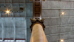
Ugly architecture details abound in this image. I feel like this is a “spot how many problems you see” game. How many do you see?
…Ok, seriously. Look away. I don’t want to be responsible for your blindness.
This #builditgram of ugly architecture details comes to you courtesy of my younger brother’s saying “This is why we can’t have nice things”. Sometimes you get a detail that is well-executed. Like this tactile crosswalk that meets ANSI standards (they set requirements for the ADA). But then you handcuff your building owner or city maintenance crew by not giving enough budget for upkeep. So instead of being able to have a skilled laborer replace the brick after an idiot with a snow plow takes it out…you’re stuck with hillbilly tetris.
Tries to imagine how this picture happened:
Architect (to owner): Alright. You put on your room wishlist that you’d like a home theater with each speaker wired separately. But that also has a mechanical disco ball. And mood lighting.
*draws it up*
Contractor: Shit. This thing takes 6 switches. I didn’t realize they were all together for this one room. Well…I have these six individuals…
The reality is that this is what poorly planned “open concept” spaces can lead to. This happens with old home renos, but don’t let it happen to you. And for the love of all things holy, align the screw faces.
Last but not least, this doozy of an aesthetic and code issue. Those are some ugly architecture details right there. My friend and I actually saw this *together* in the wild en route to a young architect’s meeting. I wish I could say that’s like spotting a unicorn in the wild, but if this post shows anything, it’s that ugly architecture details are more prolific than the pretty ones.
Ugly architecture details can happen to the best of us. Personally, I think there’s enough “ugly” in this world right now. My goal as an architect is to put more “beautiful” out there. One detail at a time.

To see the take on “Ugly” from other Architects, follow the links to the others in the #ArchiTalks group who are posting today on the theme:
- Lee Calisti – Think Architect (@LeeCalisti) “ugly is ugly”
- Brian Paletz – The Emerging Architect (@bpaletz) “Ugly, sloppy, and wrong – oh my!”
- James Mehaffey – Yeoman Architect (@jamesmehaffey) “A Little Ugly Never Hurt Anyone”
- Jane Vorbrodt – Kuno Architecture (@janevorbrodt)
- Eric Faulkner – Rock Talk (@wishingrockhome) “Ugly is in The Details”
- Michele Grace Hottel – Michele Grace Hottel, Architect (@mghottel) “Ugly”
- Kyu Young Kim – J&K Atelier (@sokokyu)
- Nisha Kandiah – ArchiDragon (@ArchiDragon) “the ugly truth”
- Mark Stephens – Mark Stephens Architects (@architectmark) “Ugly or not ugly Belgian houses?”
- Matthew Stanfield – FIELD9: architecture (@FIELD9arch)
- Jeremiah Russell – ROGUE Architecture (@rogue_architect) “unsuccessful, not ugly: #architalks”
- Jeffrey Pelletier – Board & Vellum (@boardandvellum) “Is My House Ugly? If You Love It, Maybe Not!”
- Keith Palma – Architect’s Trace (@cogitatedesign) “Behold”
- Ilaria Marani – Creative Aptitude (@creaptitude) “ArchiTalks #30: Ugly”
- Larry Lucas – Lucas Sustainable, PLLC (@LarryLucasArch) “Die Hard: 7 Ugly Sins Killing Your Community”
- Eric Wittman – intern[life] (@rico_w) “[ugly] buildings [ugly] people”