Inspiration #16
As spring settles, I’m continuously thinking about the kitchen in #ThisOldHouse. What does the new peninsula want to look like? Now that I definitely have to take the ceiling out, do I expose the beams? What do the walls want to be?
This is the latest in a weekly post of residential architecture inspiration. If you want to see past weeks, you can go here. If you want to see them curated on my pinterest (sometimes before they even hit the blog), go here.
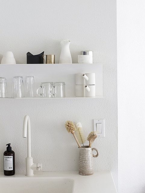
While I’m not a fan of the texture on the wall, I love the open, monotone look of the shelves and accessories in the kitchen. Simple and peaceful on the eye. (And a lot of it looks like IKEA)
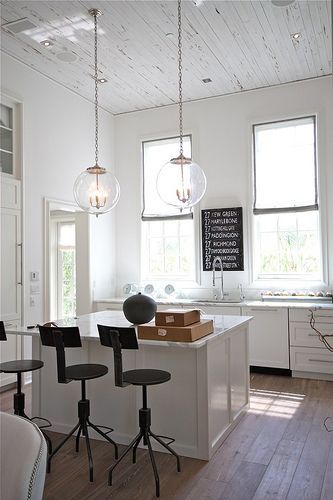
This kitchen has more of a rustic farmhouse look than I envision for #ThisOldHouse, but I like the white-washed ceiling and massive windows.
via http://beachbrights.blogspot.com/
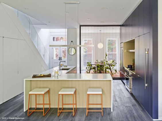
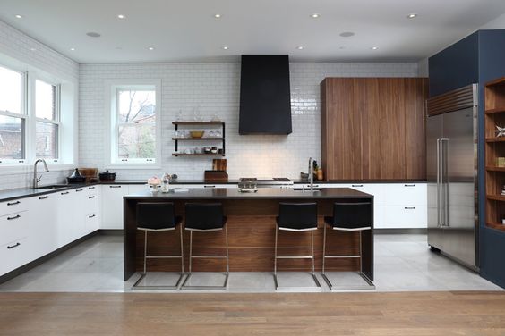
Oh, this modern flavor…how I love it. My OCD brain loves that everything is put away and in its place. I also like the wrap of the island counter continues to act as the bar seating space.
via http://architizer.com/
A bit more contemporary, but the exposed beams have me intrigued. It doesn’t seem to detract from the natural light that the room receives, either.
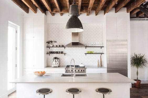
via http://architizer.com/
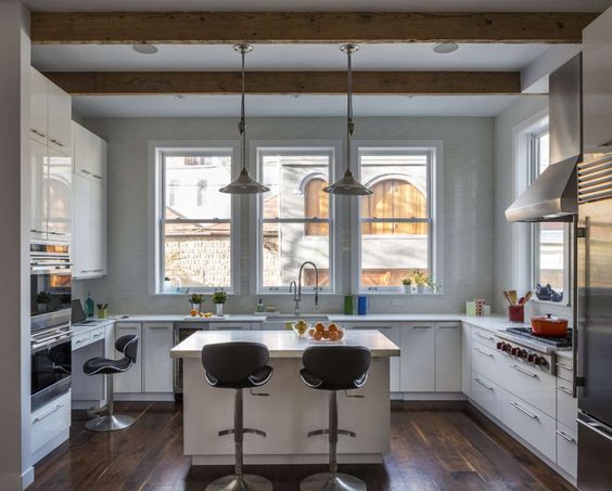
More exposed joists and definitely no detraction of light. This kitchen has a lot of things I like going on: bar seating, joists, simple, white, natural light, subway tile…
via http://www.desiretoinspire.net/
Another interesting mix of materials in a kitchen. The floor separation would work well with a renovation and there’s a good balance of enclosed cabinetry and open wall space. And, while muted, the pop of color along the right wall seems fun.
via http://www.desiretoinspire.net