#L2HQ Renovation: master bathroom design
I mentioned in last week’s goal renewal post that renovation progress at #L2HQ is high priority this year because I’ve hit the line in the metaphorical construction sand of my ability to be able to handle consistent dust. The good news is that the first big project for the year starts next week! I’ve covered inspiration, ideas, and materials both on the blog and on Instagram, but I thought this week we’d take a deeper look into the master bathroom design. Let’s go!
For a brief refresher, the above shows some demo work to the existing space. To create the master bedroom ensuite, I took an adjacent bedroom offline and demo’d through the shared closet wall. The above images show after / before for some plaster demo and framing rework to size and style the future open closet space. The door in the right of the picture is the door to the master bedroom, and to the right of that will be the vanity. To take that picture, I’m standing on what will be the tiled “wet space” in the room. But enough words, check below for a plan of the master bathroom design.
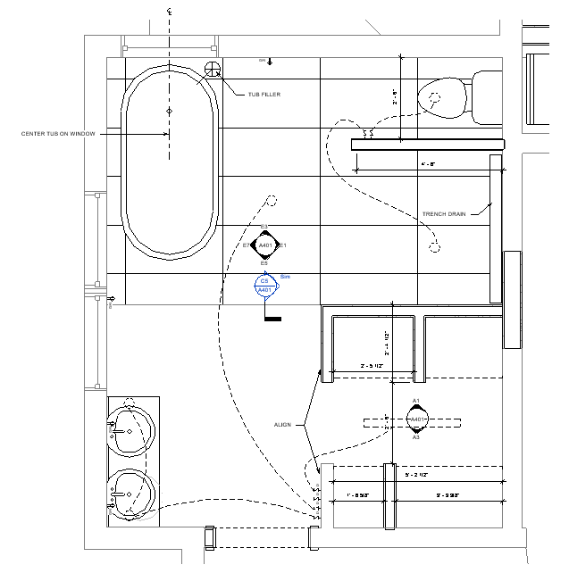
The master bathroom design is very minimal-leaning, modern, scandinavian (in its simple color palette), with a few warm wood touches. It was important to me to save as much of the existing character of the doors, windows, and floors as I could, while making the space as open and functional as possible. For bearings, the dotted opening to the bottom left of the image above shows the door that leads to the master bedroom. A galley-style, walk-in/open closet is to the right, with vanity to the left when you immediately enter the ensuite. The floor in this vanity and closet space will be the original hardwood floors, patched and refinished. (The dining room is below this space, with no ceiling, making it easy for the contractor to run plumbing and electrical from below as needed.)
The floor transitions to tile at the edge of the closet, creating a transition from dry to wet space. I had originally only wanted to tile the open shower, but with each iteration of the master bathroom design, it seemed strange to only have tile in a small, odd section of the space. By tiling the entire wet space, the flooring creates the inherent separation of spaces while making the room feel open and not chopped up or piece-meal renovated.
The main plumbing stack is in the top right corner of the drawing, so I attempted to make the master bathroom design as functional as possible with location of water fixtures. The vanity was the last fixture to find a home, and believe me – it was the subject of many conversations and sketches as I worked through the best place for it to land. The location of the plumbing stack, however, starts to make the rest of the master bathroom design layout make sense: keep the biggest lines closest (toilet), and make the other runs relatively easy so that there’s minimal joist cutting.
Two months ago, I shared this demolition picture with the master bathroom design sketched as an overlay onto the image. This is looking right in the plan towards the toilet and shower area, with a section view through the initial closet design. Below is a comparison of the finished shower area.
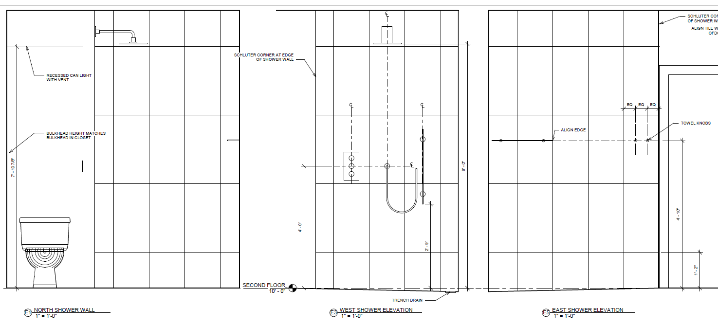
You can see the hand fixture for the shower changed location from the previous sketch, but almost everything else is in place. A couple other master bathroom design things to note that non-architects might not typically pick up on and in my mind are examples of why you hire an architect:
- As you can see from the picture, the lowered ceiling over the toilet was required because of a previous contractor poorly running lines. The new ceiling above this space will be low enough to fit a light below the dryer vent duct. More importantly, this horizontal line of ceiling is the SAME HEIGHT as the bulkheads for the open closets (framed out in the first picture of today’s blog). The singular lower line means the eye won’t frantically jump from height to height and surface to surface, but instead see the room as a calm and collective whole.
- Fixtures are centered on tile wherever possible or dimensioned equally spaced, but also hung at an accessible and functional height. For example: Typically you would want a robe/long towel hook hung around 5′-0″ or higher, but to align the glass shower shelf that high makes the shelf less functional for daily use. By finding a happy medium through the process of the master bathroom design, a height was selected that’s functional (for me) at both uses and aligned to maintain a simple line.
- Use of space is important and no one likes getting into a shower space to then turn on the water and be blasted with cold water until it heats up. By positioning the control fixtures to the outside of the shower wall, I will be able to simply turn the water on without being in the jet stream.
As a reminder, the right and middle tiles made the final selection. All of the tile floor space shown in the plan above is the black, large format (18″ x 36″) tile with grey veining. All of the wall tile at the shower and vanity will be the right, large format (14″ x 27″) 3D wave tile with grey veining, run vertically. I SOOO can’t wait to see them in the space.
Actually I cant wait to see all of this master bathroom design come together. Only another week!